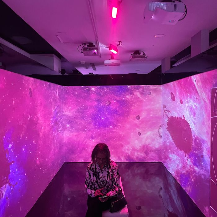
At Pantone’s Color of the Year announcement party. Photo: Brock Coylar
Every December for the past 24 years, Pantone announces its “Color of the Year.” According to its website, the decision is made at a “secret meeting” “in a European capital” with “representatives from various nations’ color standards groups” (which admittedly sounds a little bit neocolonialist). It’s not entirely clear how this color moment is imposed on the rest of us, but the decision is dutifully announced by the press, who, for whatever reason, sees great importance in it.
For what it’s worth, 2022’s color was Pantone 17-3938, Very Peri, a purplish hue that was described at this time last year as “a symbol of the global zeitgeist of the moment and the transition we are going through.” It is not anywhere in my wardrobe, however.
Still, I stopped by this year’s announcement party on Miami Beach during Art Basel. After a very long speech by one of the color commissaries, who hotly declared things like, “Color can change the world,” it came time for the official decree. A small group had gathered in a black box surrounded by three screens, and after a short video showing peoples of all ages, sizes, and, yes, colors doing various casual things — applying lipstick, dancing, standing in front of waterfalls, walking out doors and through grass pastures, wearing glasses — the screens colored themselves with “Viva Magenta,” technically known as Pantone 18-1750. The crowd oohed and aahed at this unnatural (literally, it doesn’t exist) shade of pink.
Pantone explained that this year’s choice has something to do with the metaverse — or the “magentaverse.” So afterward, the brand opened up a number of rooms to explore with shiny digital installations and VR goggles. Walking around, though, I started to think Pantone might be trying to say something else … One placard talked about “Viva Magenta” being “an all-embracing color whose expression of vitality … increasingly blurs the worlds of gender and generations.” Another said the color is “encouraging experimentation and self-expression.” It is “a boundary-less shade that is manifestly out there.” The video we watched featured butterflies and clearly gay people striking poses. Another woman who gave a speech at the event declared, “Magenta welcomes anyone and everyone … It does not boldly dominate but takes an ‘iron fist in a velvet glove’ approach.” She continued, “All of us have a unique sense of self, and one of the bravest things we can do is show the world our true selves.”
I don’t know what you make of all of this, but by the time I left, I couldn’t help but think they were trying to tell me this color, for whatever reason, is coming out as queer. A quick Google search confirmed it’s awfully close to the magenta on the bisexual-pride flag, which represents, according to the guy who created it, “attraction to the same sex.” Maybe, I thought, Pantone is trying to atone for the fact that its Color of the Year in 2016 was two very gendered colors: blue and pink (a.k.a. Trump and Hillary?).
Anyway, I’m probably overthinking it too. On my way out the door, a European fashion designer told me, “It means nothing.” Right now, she says, her label is selling lots of greens. I do look good in green.


